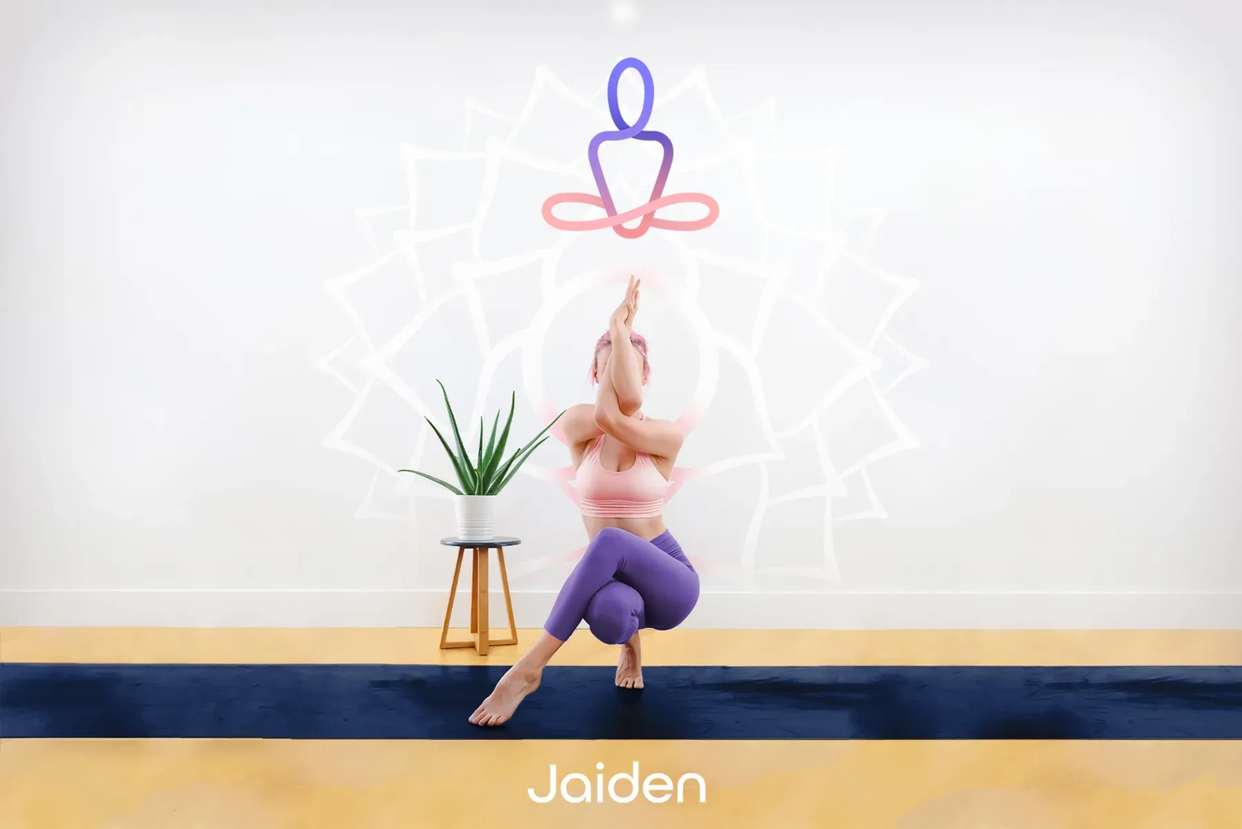
If Buddha were a babe, she would shop at Jaiden, where eastern belief meets western fashion. I brought those two worlds together in the brand’s logo, illustrations and digital expression.
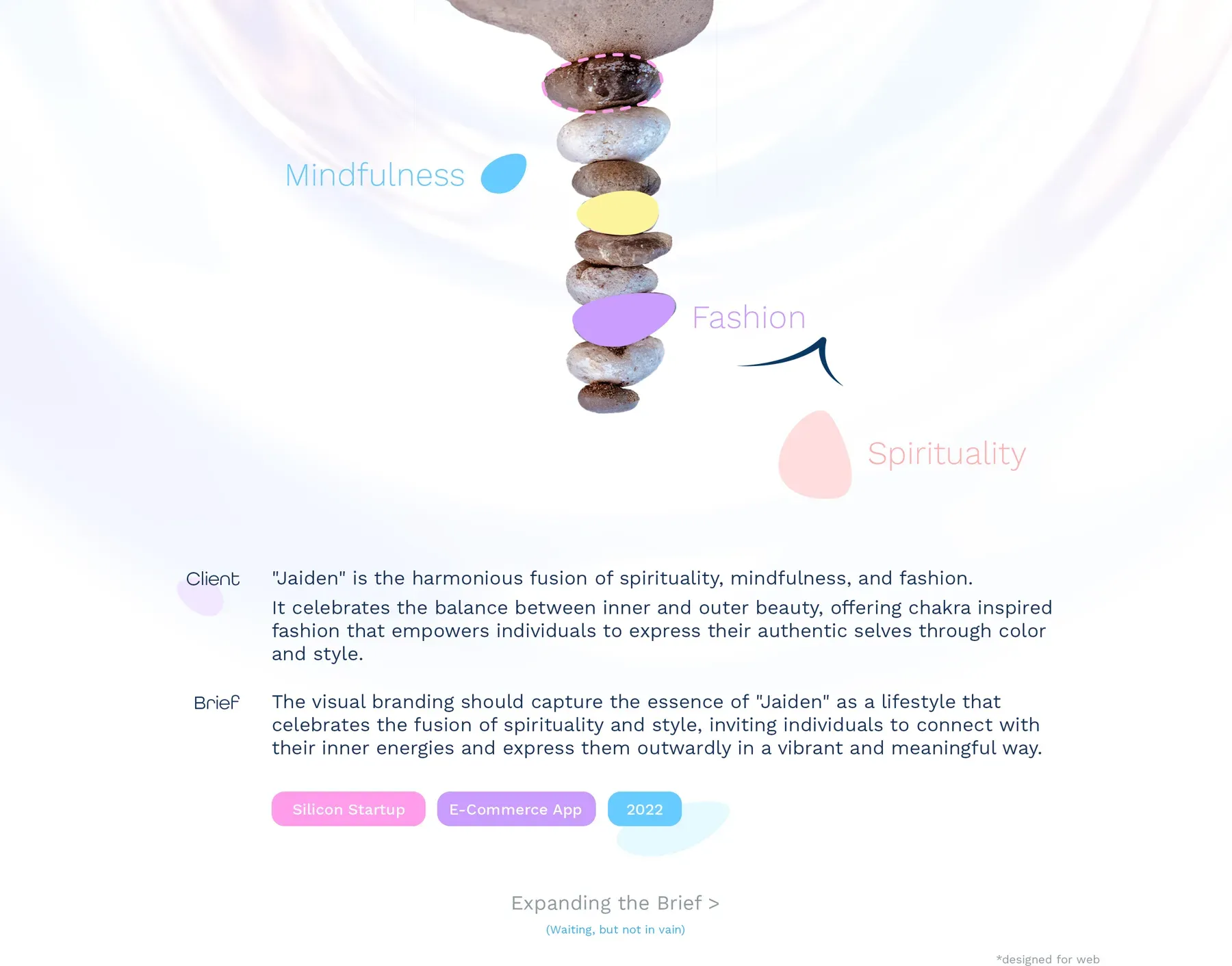
Jaiden is a lifestyle brand in which people follow astrology advice for fashion, so each recommendation depends on the individual. It began as an early-stage Silicon Valley product, and its name changed midway after product-market fit research.
Uniting two desires in one identity
The founders’ research found an overlap between Eastern spiritual interests and fashion in the western United States. I owned branding and art direction at Quovantis while a product designer handled the eCommerce UX.
Keeping the calm without losing the style
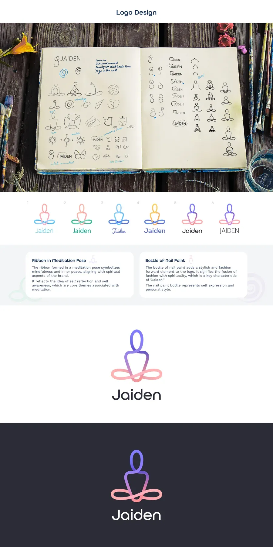
Mood boards built on calm, spirituality and style set the direction. Persona studies and two archetypes, the Sage and the Magician (classic characters a brand can play), framed the visual exploration.
Letting colour carry the connection
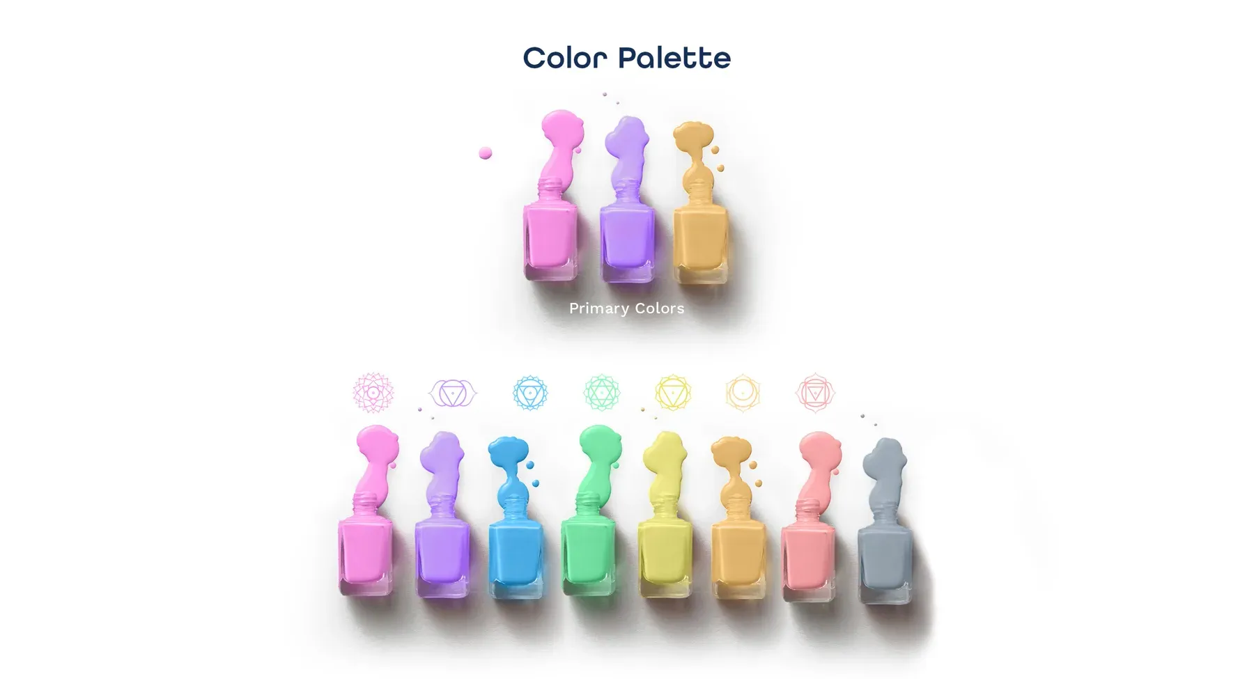
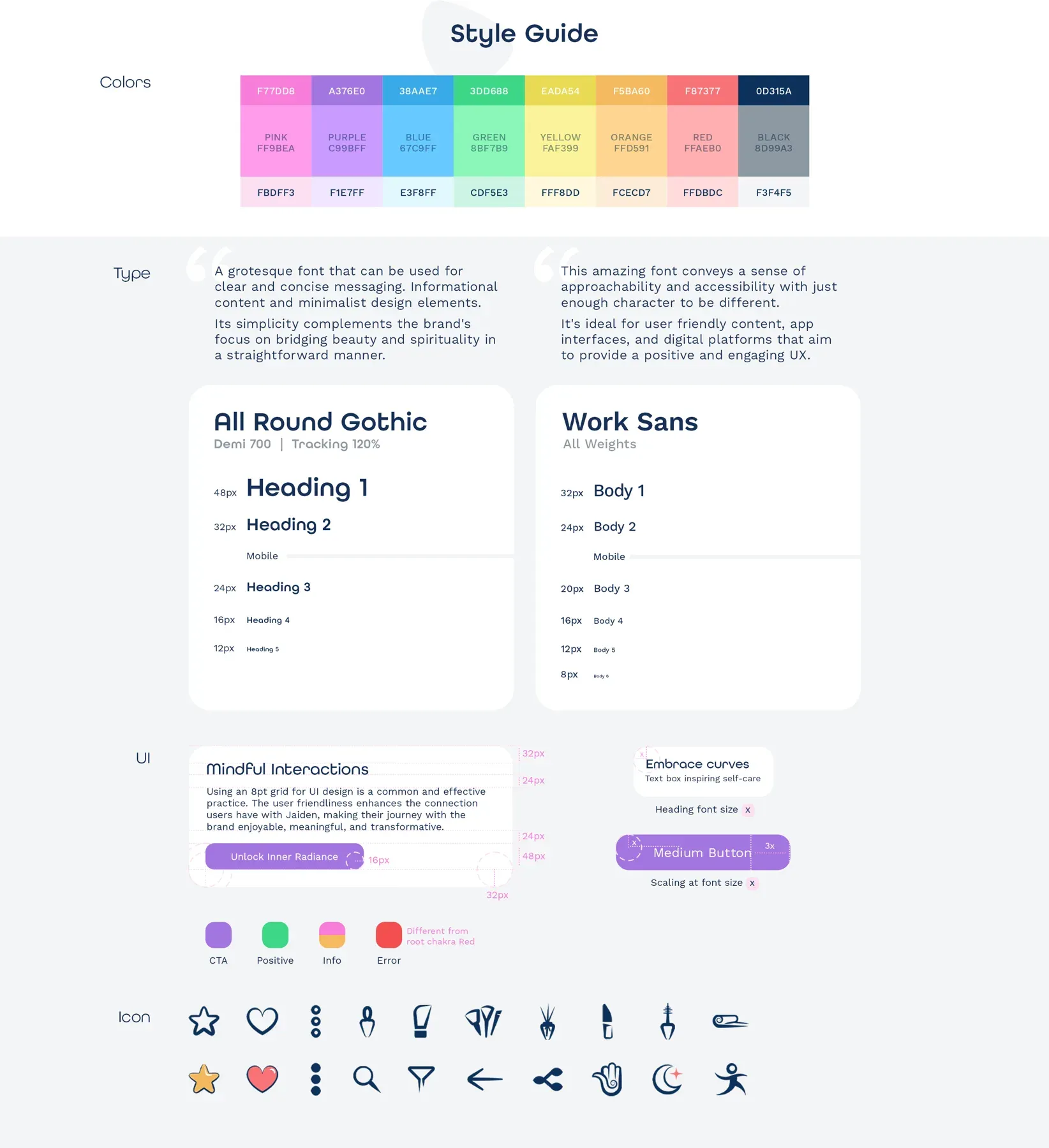
Chakra colours became a palette presented through nail-polish bottles. All Round Gothic and Work Sans set the type while icons and UI components codified the digital expression.
Speaking one visual vocabulary across illustration and photography
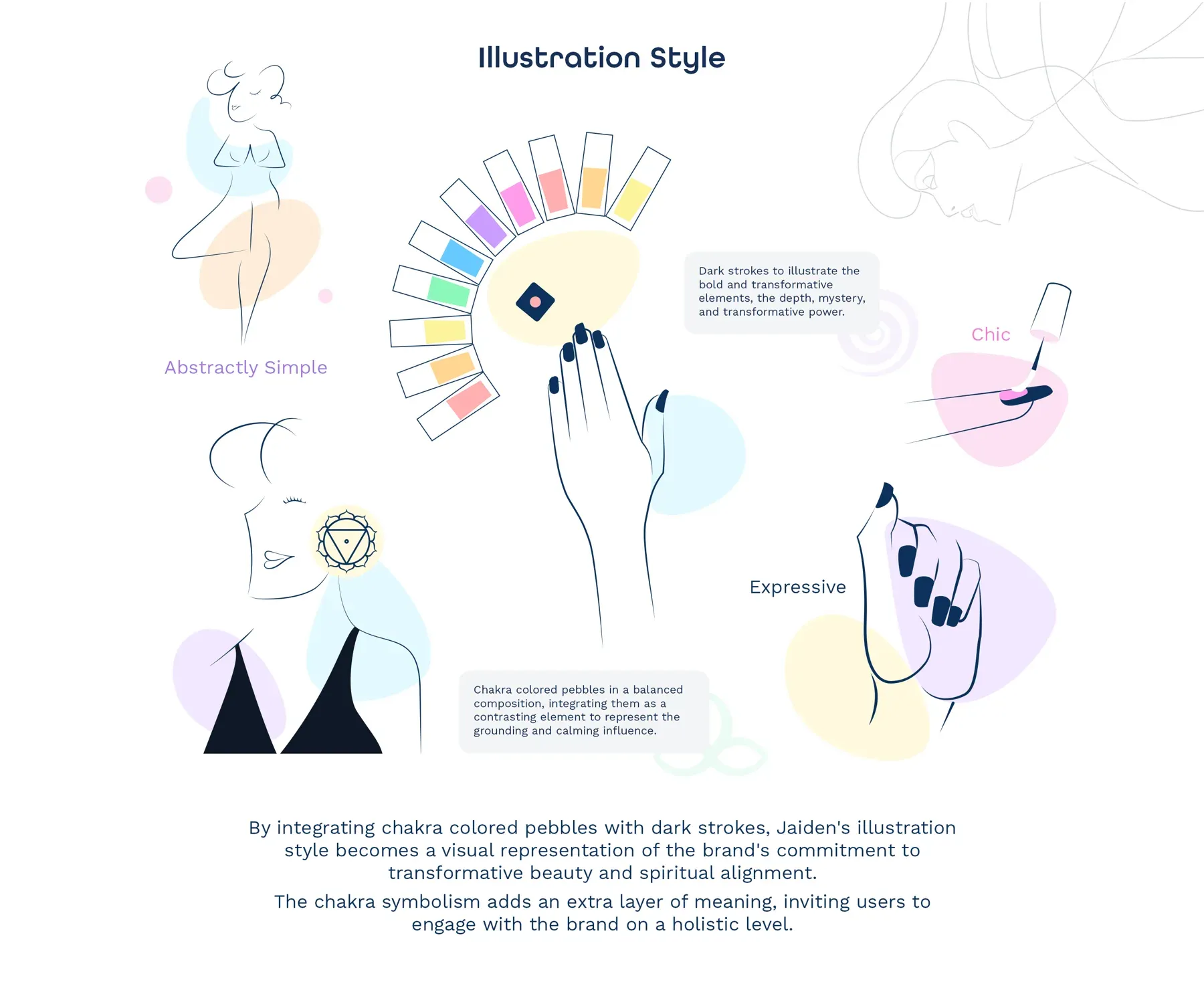
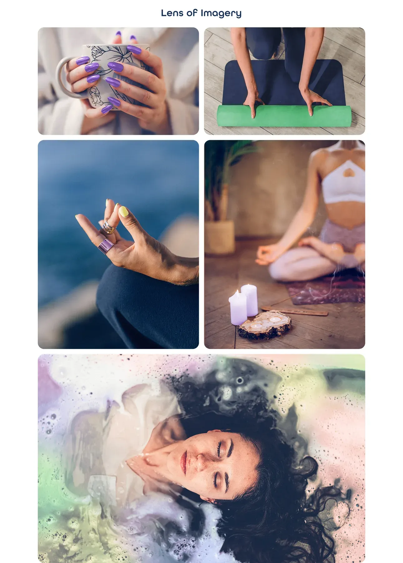
Line-drawn figures, coloured pebbles and nail-art hands carried the identity into illustration. Photography paired manicured hands with yoga and meditation.
Leaving a vocabulary that scales
Palette, type, icons and illustration form one vocabulary, which Jaiden’s new products and campaigns can use without a new brief.