FarMart’s new brand language needed a memorable debut. I visualised a product marketer’s brand growth story as a seed growing into FarMart’s logo.
FarMart connects the food network from farmers to consumers. A new brand language only works if people meet it in a moment they remember, and the launch film was that moment.
Rooting the palette in food
I framed FarMart’s identity in greens, wheat yellow, cream, mint, brown and orange, because those colours belong to food.

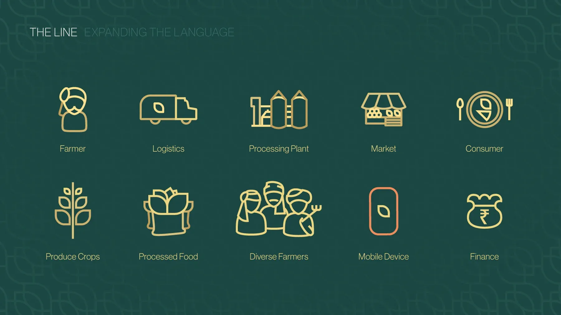
Distilling the network into line icons
Gold line icons trace the whole food network, from the farmer to the consumer.
Animating the brand language into a launch film
The film carries the line icons from “it all started with a seed” to the Rewarding Network lockup.
Giving the brand a story to return to
The seed-to-network story gives FarMart’s later work a starting point, and the same icons can explain any new part of the network.