
The problem
Hydron is H2LooP’s AI assistant for hardware engineers, used in a text-only terminal. Important commands were shown in the hint row for people to get started. It breaks trying to accommodate new product features.
A developer regularly prefers Command Line Interface (CLI), over Integrated Development Environment (IDE) like VS code. CLI tools are light on resources that matters for long automated sessions, simple to build and maintain, allows building workflow pipelines.

Why it breaks
Shortcuts demand recall, and people recognise faster than they remember. Recognition worked when the row showed 2 commands. With every new feature the hint row kept widening affecting its skimmability, on smaller screens it got truncated.
Where competitors stand
Gemini, Claude, Cursor, OpenCode, Roo, Codex and Oh My Pi all demand looking up documentation or a command list. Adding to the chaos, every product uses different shortcut combo.
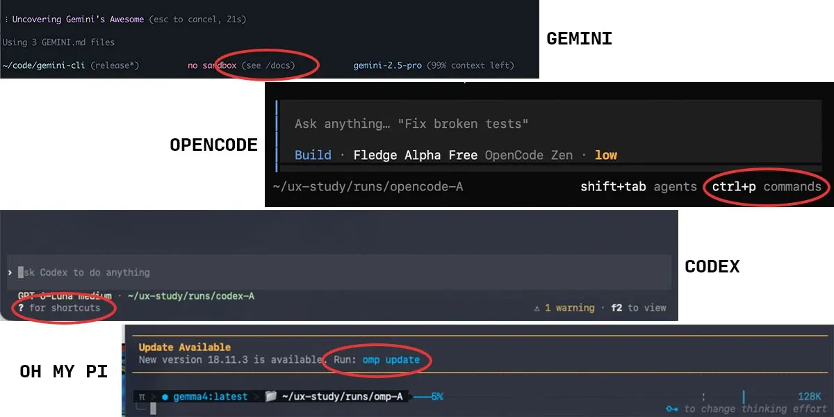
Clean prompt + every action findable + room for new features = Hidden drawer
The interaction: a hidden drawer
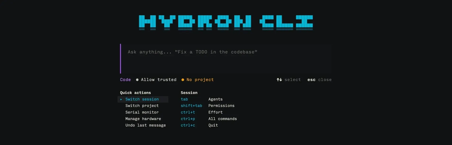
In a terminal, the default navigation through chat are arrow keys. At the end of chat, DOWN arrow does nothing which is how people know they’ve reached the end. Opening a drawer assures the same and they’ve found it out of habit without looking up documentation/requiring command recall.
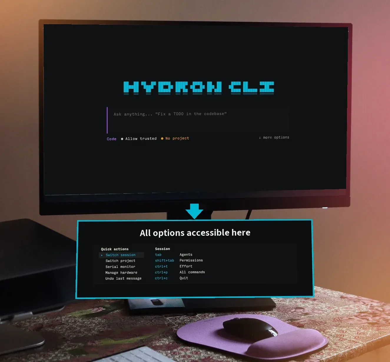
Imagine a workdesk; the top stays clear and tools sit inside a drawer, out of sight but one pull away. I gave Hydron the same model: the screen stays clean, and the down arrow pulls out a drawer containing frequent actions.
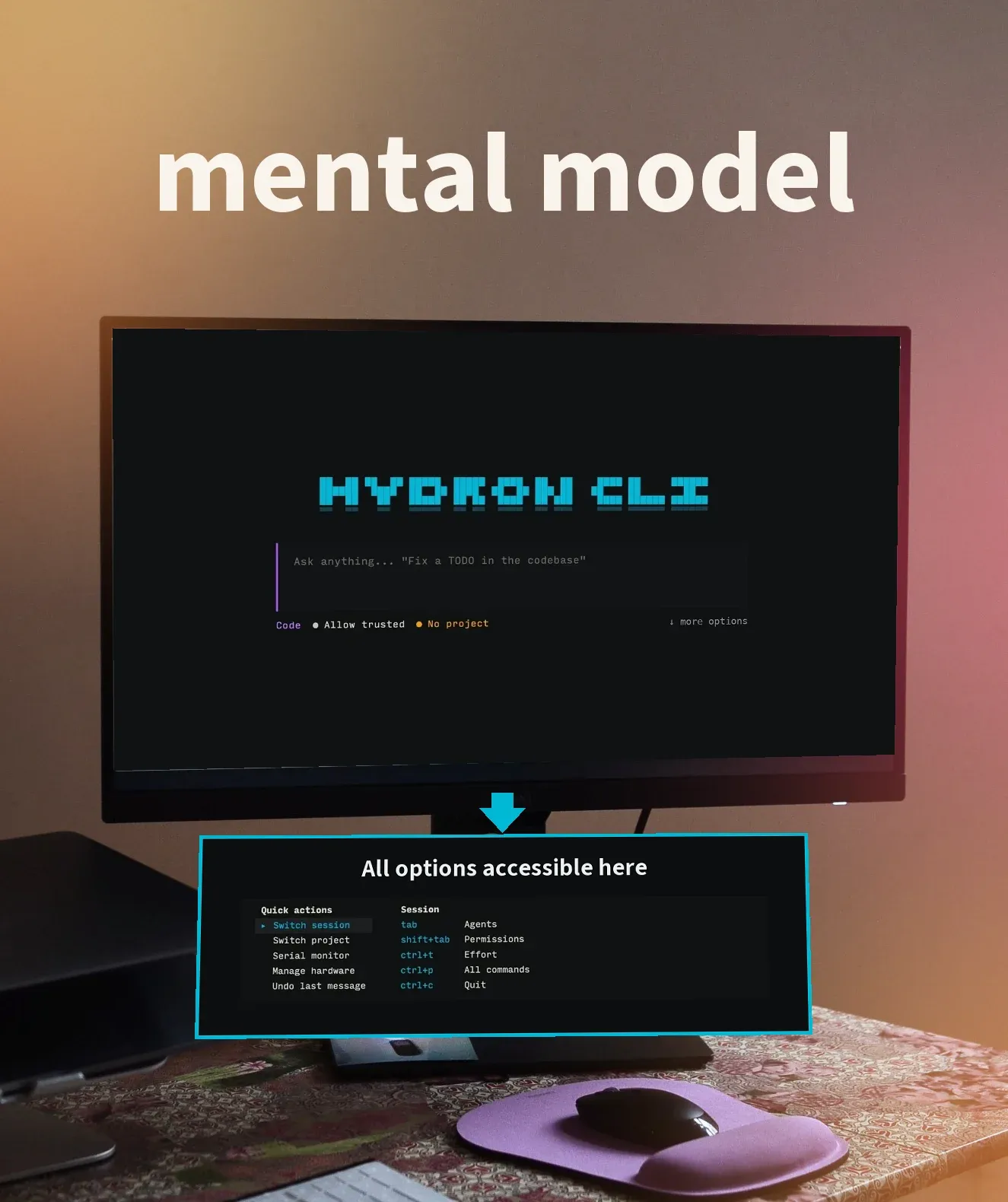
Competing solutions
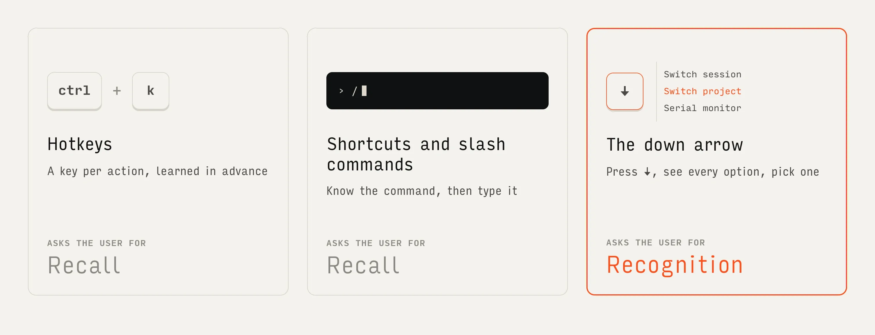
The new way

The down arrow now opens a drawer: New features & quick actions as list, another column for session controls replacing hints. Entire row is replaced by 1 simple hint, which users can hide after learning.
I built it with one engineer in three days, to production.
The challenge was persuasion: deep tech engineers had to see the value of an alternate interface.
Why it matters
Features stay discoverable as the product grows.
User configurable actions for personalised workflows.
New plugins will get dedicated tabs, putting horizontal navigation to use.
Recognition replaces recall.
Alongside the drawer I designed Hydron’s guided path to the first project.